Kategorie: wordpress

Webseite mit Zurbs Foundation 6 Framework

24. März 2016 - CSS, JavaScript, wordpress

Nachdem mein langjähriger Favourit für responsive Webseiten, YAML, seit zwei Jahren zu meinem Bedauern keinen „Puls“ mehr hat, musste ich meine Webseite auf ein neues Framework umstellen und habe dafür Foundation 6 gewählt.

Foundation ( oder besser Foundation for Sites) ist bei uns weniger bekannt als Bootstrap.

Bootstrap 3 kannte ich schon aus einigen Projekten.  Die Version 4 ist schon seit vielen Monaten ( oder Jahren?) in Beta, und wenn man etwas Neues machen möchte, kam die alte Version nicht in Frage.

Zurb ist darüber hinaus eine interessante Company. Neben Foundation for Sites gibt es noch Foundation for Emails (=responsive HTML Emails) und Foundation for Apps (=responsive Web Apps für AngularJS). Beide zusätzlichen Produkte möchte ich in der nächsten Zeit ebenfalls ausprobieren.

Wenn man schon mit Bootstrap gearbeitet hat, kommt man mit Foundation gut zurecht. Die Klassen haben andere Namen aber ansonsten ähnliche oder sogar identische Funktionen.

Hier ist eine ausführliche Gegenüberstellung der Funktionen von Bootstrap und Foundation 6

Besonderheiten bei Foundation:

Mit „Interchange“ kann man für die verschiedenen Ausgabegeräte unterschiedliche HTML Fragmente oder unterschiedlich große Bilder anwählen. So wird z.B. die Ladezeit  der Webseite verbessert.

Mit „Block Grid“ kann man auf einfache Weise eine Anzahl von Content-Blöcken in einer Zeile gleichabständig verteilen.


Als Basis für meine Webseite habe ich das auf Foundation 6 basierende Theme Joints WP verwendet und modifiziert.

Bugfix contactform7 do_shortcode with special tags

4. Oktober 2015 - PHP, wordpress

Recently I tried to use contact form 7 to display a contact form which contains a special email tag (e.g. [_post_title] ) in the subject field with do_shortcode().

It simply didn’t work. I tried this fix but without success. The special tag wasn’t resolved, either .

Maybe there are some limitations in the way, WordPress has implemented do_shortcode(). Some information about that is here

Nevertheless, I had to solve my problem and this is my hack:

// this goes inside the loop
$my_post_title=get_the_title( get_the_ID());
ob_start();
echo do_shortcode('[contact-form-7 id="2070" title="Product inquiery"]');
$unresolved=ob_get_contents();
ob_end_clean();
echo preg_replace('/_post_title/',$my_post_title,$unresolved);

As you can see, I had to give up the idea of using the special tag [_post_title] inside contact form 7 and I’m using the string „_post_title“ in my form,  instead.

Then php output buffer and preg_replace will do the work for me.

Google Pagespeed and WordPress

28. April 2015 - wordpress

Pagespeed (PS) doesn’t need to be explained. It’s a metaphor for: If you’re too slow, you won’t show up (at least in Googles search results for mobile surfers). But how complicated and time consuming is it to get a high PS score? In the past days I had the chance to fiddle around with a fairly new, simple, and pretty unimportant website of a friend of mine. It’s a classic WordPress site with header and footer and plugins and Google fonts.

Apart from that it’s responsive, thanks to the YAML framework, mobile friendly according to Google webmaster tools, and it gains 100/100 user experience from PS.

And 50/100 for the rest. Google says, 85/100 is high-performance. Why not reach for high-performance?

Looking for plugins

That’s the classical WordPress approach. Leave the website as it is and find a good plugin. However, I had a very confusing experience with plugins. When PS complained about missing server caching, nonexistent data compression and absent minification of resources, I tried out several plugins. Some simply didn’t work or showed an odd behavior: The first PS session rocketed the site to 80, the subsequent sessions degraded it to my well known 50 points from 100 or even below.

Compression and caching by the provider

Caching plugins make significant changes to your htaccess file, which made me feel uncomfortable. Hence, I stopped using caching plugins, followed the recommendations of my provider, and came up with this htaccess solution:

# BEGIN strato
# Caching einrichten
FileETag MTime Size
ExpiresActive OnExpiresDefault "access plus 1 months"
ExpiresByType text/css "access plus 1 months"
ExpiresByType application/javascript "access plus 1 months"
ExpiresByType application/x-javascript "access plus 1 months"
ExpiresByType image/gif "access plus 1 months"
ExpiresByType image/jpeg "access plus 1 months"
ExpiresByType image/jpg "access plus 1 months"
ExpiresByType image/png "access plus 1 months"
ExpiresByType image/x-icon "access plus 1 months"
SetOutputFilter DEFLATE
AddOutputFilterByType DEFLATE text/plain
AddOutputFilterByType DEFLATE text/html
AddOutputFilterByType DEFLATE text/xml
AddOutputFilterByType DEFLATE text/css
AddOutputFilterByType DEFLATE text/javascript
AddOutputFilterByType DEFLATE application/xml
AddOutputFilterByType DEFLATE application/xhtml+xml
AddOutputFilterByType DEFLATE application/rss+xml
AddOutputFilterByType DEFLATE application/javascript
AddOutputFilterByType DEFLATE application/x-javascript
# END strato

Retrospectively, this htaccess modification should be your last step to optimize your website for PS, because you always have to undo them after the subsequent changes to see the effect.

This step improved my score: 57 points from 100

Render-blocking javascript and css

This PS section listed all my css files and all my js files as render-blocking. I started with the css. Typically, a YAML css is like the following style.css:

@import url("http://fonts.googleapis.com/css?family=Droid+Serif");
@import url("http://fonts.googleapis.com/css?family=Droid+Sans:700");
/* framework core */
@import url(yaml/core/base.css);
/* screen layout */
@import url("css/hlist.css");
@import url("css/gray-theme.css");
..

All the css @imports were replaced by the original css files, and in a second step by their minified versions, which PS offers to download. The two font @imports were combined into one and then replaced by a link in the site’s header:

<link href='http://fonts.googleapis.com/css?family=Droid+Serif|Droid+Sans:700' rel='stylesheet' type='text/css'/>

The result: 61 Points, four remaining render-blocking css files (style.css, google fonts, and two others, which came with one of my ajax based contact-form plugins) As I didn’t want to give up this plugin, I decided that the css optimization was good enough now.

Remaining: The javascript.

On my test website, I had jQuery and a lot of jQuery-UI scripts included with a plugin. First, I put all of them in the footer of the site, however, I didn’t get a better score. Then I used the wp-deferred-javascripts plugin. This eliminated all the “render-blocking javascripts” messages but didn’t improve the score, too.

Use images with higher compression

In terms of image compression, PS gives preference to its own compression standards. Therefore, I replaced nearly all images by the compressed samples from the PS download. In my opinion, these images are a bit too much compressed. Anyhow, my result was now 72 from 100 points. That should do for this website.

Conclusion

To achieve a 72 score cost me more than a workday. That means for me: recalculate the price-tags for a “simple” website. And what happens, if a customer wants a higher score? Then I would have to analyze the website in more detail and restructure css and js to speed up the rendering of the above-the-fold parts; all of which I skipped in this case. The good news is: Google accepts that the internet too has only limited resources. We should pay more attention to our css and images and the way our sites are rendered. And is it really necessary to pile up a stack of javascript only to just show a neat jQuery-UI dialogbox with a contact form?

wordpress – how to write responsive posts-part 2

30. Dezember 2014 - wordpress

Responsive posts/ YAML framework with WP shortcodes


In this follow-up to the first part we will write a plugin to create responsive posts. The plugin provides the following shortcodes:

‚cap‘ for caption right to or under an image
‚img_f‘ for caption under image, both floating left
‚2c_l‘ for column right
‚2c_r‘ for column left


In diesem Beitrag wollen wir ein Plugin schreiben, um responsive Posts zu erzeugen . Es unterstützt folgende shortcodes:

‚cap‘ Bildtext rechts oder darunter
‚img_f‘ Bildtext unter einem Bild, beide floaten links
‚2c_l‘ rechte Spalte
‚2c_r‘ linke Spalte

The code:

/*
Plugin Name: nf_post_styler
Plugin URI: http://www.it-in-a-box.com/
Description: some simple styles for posts
Author: Norbert Felgendreher
Version: 1.0
Author URI: http://www.it-in-a-box.com/ 
*/

if ( !function_exists('add_action') ) {
	header('Status: 403 Forbidden');
	header('HTTP/1.1 403 Forbidden');
	exit();
}
if ( !class_exists('simple_styles_for_posts') ) { 
	class simple_styles_for_posts {

	function __construct() {
	
		add_shortcode('cap', array(&$this, 'caption_right_or_below'));
		add_shortcode('img_f', array(&$this, 'image_floats_in_text'));
		add_shortcode('2c_l', array(&$this, 'two_columns_left'));
		add_shortcode('2c_r', array(&$this, 'two_columns_right'));
		
	}

	function caption_right_or_below( $atts, $content = null) {
		return '<div class="ym-contain-dt">' . $content . '</div>';
		}
	function image_floats_in_text( $atts, $content = null) {
		return '<div class="float-left">' . $content . '</div>';
		}
	function two_columns_left( $atts, $content = null) {
		return '<section class="ym-grid linearize-level-2">'.
		'<article class="ym-g50 ym-gl"><div class="ym-gbox">' . $content . '</div></article>';
		}
	function two_columns_right( $atts, $content = null) {
		return '<article class="ym-g50 ym-gr">'.
			'<div class="ym-gbox">'. $content . '</div></article></section>';
		}
	
	} // End Class
	$simple_styles_for_posts = new simple_styles_for_posts();
} 

Examples:
Please use shortcodes whithout whitespace inside square brackets

Caption left or under image:
[ cap ]
your image.jpg
your caption
[ /cap ]
Image with caption, both floating left:
[ img_f ]
your image.jpg
your caption
[ /img_f ]
lorem ipsum ...
two columns:
[ 2c_l ]
column left content
[ /2c_l ]
[ 2c_r ]
column right content
[ /2c_r ]

Both, 2c_l and 2c_r shortcodes must be present, otherwise a markup error will happen.

Download of plugin here

wordpress – how to write responsive posts-part 1

18. Dezember 2014 - wordpress

Wer bereits einen responsiven Blog hat und komplexere Beiträge mit Bildtexten unter den Bildern oder sogar mit Spaltenlayout schreiben möchte, findet hier ein paar Anregungen.
Strukturierte Beiträge mit Bildern, Bildtexten oder Spalten können trotz sorgfältig aufgebautem responsiven Layout der gesamten Seite schnell auf schmaleren Displays unleserlich werden.
Dagegen hilft nur eins: man muß auch den Post mit dem responsiven Framework stylen, mit dem die Seiten erzeugt wurden.
Im vorliegenden Fall ist dies YAML.

Many people don’t need resposive posts as long as the basic framework of their blog is responsive enough.
But if you want to write more complex posts, it may become a concern.
In the following we describe how to create responsive posts with images, image captions and even colums using the YAMl framework.

Example 1:

Bild und Bildtext

image and caption

Lissabon037 600x400

Bildtext neben oder unter dem Bild, caption on the right side or below

Markup

<div class='ym-contain-dt'> 
your image.jpg
your caption
</div>

Das nach links gefloatete Bild und der Bildtext werden mit einem Div umgeben, das das Floaten beendet. ym-contain-dt ist eine Klasse des YAML Frameworks

The div around left floated image and caption stops floating of subsequent content. ym-contain-dt is a class of YAML Framework

Example 2:

Bild und Bilduntertext mit umfließendem Text

image and fixed caption below, floating in block of text

Lissabon037 600x400

Bildtext unter dem Bild, caption always below image

Lorem ipsum dolor sit amet, consetetur sadipscing elitr, sed diam nonumy eirmod tempor invidunt ut labore et dolore magna aliquyam erat, sed diam voluptua.Lorem ipsum dolor sit amet, consetetur sadipscing elitr, sed diam nonumy eirmod tempor invidunt ut labore et dolore magna aliquyam erat, sed diam voluptua.Lorem ipsum dolor sit amet, consetetur sadipscing elitr, sed diam nonumy eirmod tempor invidunt ut labore et dolore magna aliquyam erat, sed diam voluptua.Lorem ipsum dolor sit amet, consetetur sadipscing elitr, sed diam nonumy eirmod tempor invidunt ut labore et dolore magna aliquyam erat, sed diam voluptua. Lorem ipsum dolor sit amet, consetetur sadipscing elitr, sed diam nonumy eirmod tempor invidunt ut labore et dolore magna aliquyam erat, sed diam voluptua.Lorem ipsum dolor sit amet, consetetur sadipscing elitr, sed diam nonumy eirmod tempor invidunt ut labore et dolore magna aliquyam erat, sed diam voluptua.Lorem ipsum dolor sit amet, consetetur sadipscing elitr, sed diam nonumy eirmod tempor invidunt ut labore et dolore magna aliquyam erat, sed diam voluptua.

Markup

<div class='float-left'>
your image
your caption
</div>
your text floating around image and caption

Ein Div umschließt Bild und Bildunterschrift und floated es nach links. Der Text läuft herum.

div encompasses image and fixed caption below, both floating in block of text

Example 3:

Zwei Spalten; ab einer bestimmten Display-Breite stehen die Spalten untereinander

two colums; from a certain display width on, the colums appear one below the other

Lissabon037 600x400

Bildtext unter dem Bild, caption below image

Lorem ipsum dolor sit amet, consetetur sadipscing elitr, sed diam nonumy eirmod tempor invidunt ut labore et dolore magna aliquyam erat, sed diam voluptua. At vero eos et accusam et justo duo dolores et ea rebum. Stet clita kasd gubergren, no sea takimata sanctus est Lorem ipsum dolor sit amet. Lorem ipsum dolor sit amet, consetetur sadipscing elitr.

Lissabon037 600x400

captionunder image, aditional text below image

Lorem ipsum dolor sit amet, consetetur sadipscing elitr, sed diam nonumy eirmod tempor invidunt ut labore et dolore magna aliquyam erat, sed diam voluptua. At vero eos et accusam et justo duo dolores et ea rebum. Stet clita kasd gubergren, no sea takimata sanctus est Lorem ipsum dolor sit amet. Lorem ipsum dolor sit amet, consetetur sadipscing elitr.

Markup for left column:

<div class='ym-grid linearize-level-2'>
<div class='ym-g50 ym-gl'>
<div class='ym-gbox'>
your image
your caption
you text
</div>
</div>

Markup for right column:

<div class='ym-g50 ym-gr'>
<div class='ym-gbox'>
your image
your caption
you text
</div>
</div>
</div>

Dies ist das aufwändigste Markup aller Beispiele. Im Post wird ein YAML Grid erzeugt. Die Klasse linearize-level-2 stellt die beiden Spalten unter einer bestimmten Display-Breite untereinander

This is the most sophisticated markup of all examples. We create a YAML grid that falls back to a linearized representation if display width is getting very small

Dies ist die zeitraubenste Methode, seine komplexen Beiträge zu schreiben. Alles muss im Textmodus des Editors angelegt werden. Im nächsten Teil schauen wir nach, welche Hilfsmittel WordPress und der Editor tinymce uns zur Verfügung stellen

As we have to create all this responsive blog structures in the text modus of the wordpress editor, we will investigate in the second part of this post what wordpress and it’s tinymce editor offers us lazy people for help

Part 2 of this post

It-in-a-box: neues responsive WordPress Blog Theme mit YAML 4

11. Dezember 2014 - wordpress

Back to the roots

It-in-a-box.com hat sich ein neues Layout verpasst. Es ist responsiv geworden und sollte nun auch auf einem Smartphone seinen Platz finden. Die roots waren WordPress und YAML4. Beide sind genial und nicht allzu schwer zu verheiraten.

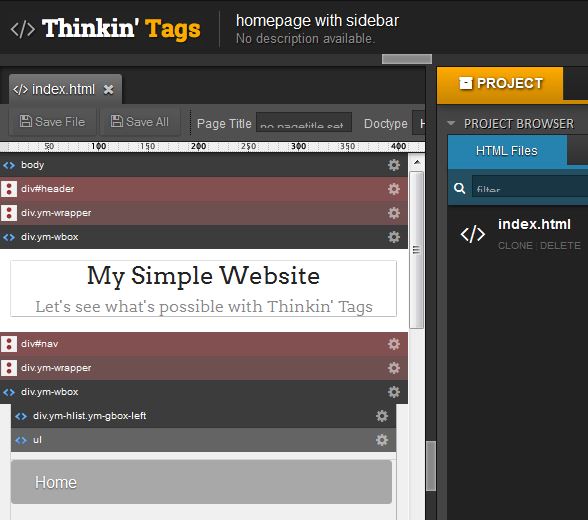
Man erstellt sich interaktiv ein YAML Layout (bei YAML 4 mit thinkintags.com)
und zerlegt die Index-Datei in header, main und footer. In header und footer baut man die für WordPress wichtigen Tags ein.

Das ist an vielen Stellen schon beschrieben worden und muss nicht wiederholt werden.

Viel Spaß damit

English Summary: this is a short note of how to combine WordPress with YAML 4  framework in my blog.  If You need more information please leave a comment.

wordpress hack for post pagination on static subpages

22. November 2014 - wordpress

Even in the times of wordpress 4.x, problems like  „How do I paginate the posts in my blog correctly „, „… only the first page of my blog is showing…“ or „… broken pagination…“ turn up in question and answer sites like stackoverflow.com over and over.

Of course, there are lots of tips and answers available. However, none of them solved mine and here is my hack.

Let’s assume, my blog has the url „myhomepage.com/blog“. I’m using „nice“ permalinks, so the post „mypost“ has the url „myhomepage.com/blog/mypost“.
„blog“ is a static subpage with a template file for the code.

The template looks like this:


get_header();
…
global $wp_query;
$orig_query = $wp_query; // save old wp_query
$paged = ( get_query_var('page') ) ? get_query_var('page') : 1; // 'page' because we are on a static page
$args = array(
'category_name' => 'blog',
'paged' => $paged,
'order' => 'DESC'
);
$wp_query = new WP_Query($args);
if ($wp_query->have_posts()) {
while ($wp_query->have_posts()) {
$wp_query->the_post();
//.. do something with the post ..
}
next_posts_link();
previous_posts_link();
} else echo "no post available";
$wp_query =$orig_query;  //restore wp_query
get_footer();

Trying this, I found that all is working well except for the part where get_query_var() comes in. When the blog is called with the initial link „myhomepage.com/blog“, get_query_var() is not defined and $paged defaults to 1, which is ok. The first blog’s posts appear and next_posts_link() creates the correct link „myhomepage.com/blog/page/2/“ for the second page.
Alas, using it, get_query_var() is still undefined, and $paged again defaults to 1.

Obviously, get_query_var() can’t pull the page number from „myhomepage.com/blog/paged/2/“ for reasons I don’t now.

So, I decided to lend it a hand:

global $wp_query;
$orig_query = $wp_query;

$pattern = "/\/page\/([0-9]+)\//";
$subject = "$_SERVER[HTTP_HOST]$_SERVER[REQUEST_URI]";     // the url
if (get_query_var('page')) $paged=get_query_var('page');   // give get_query_var() a chance
elseif (preg_match($pattern, $subject, $matches)) $paged=$matches[1]; // otherwise ...
else $paged=1;
...

Now pagination is working, and as we use $wp_query, all advanced pagination plugins that depend on it will work, too.

Erste Erfahrungen mit dem Media Uploader ab WP Version 3.5

18. Juni 2014 - wordpress

Vom API des neuen Media Uploaders gibt es keine offizielle WordPress Dokumentation, auch keinen halboffiziellen Artikel eines WP Insiders.

English Summary: WordPress new Media Uploader works in the dashboard from version 3.5 on but is somehow concealed because there is no official documentation. Or to be more precise: there is no documentation at all, just the core  code. Though many theme or shop developers consider it an essential and indispensable component in a CMS system.

Fortunately some developers dug through the core code and shared their experiences with the community.
Solutions to implement the media uploader rank from rather simple to very complicated.

Als einziges Hilfsmittel steht der community nur der core code zur Verfügung, wenn der media uploader eingesetzt werden soll.
In dieser Hinsicht hat sich jedenfalls nichts verbessert

Die Lösungen sind: eher einfach, mittelkomplex oder hochkomplex

Ich verwende die eher einfache Variante, gefunden bei http://stackoverflow.com/questions/13847714/wordpress-3-5-custom-media-upload-for-your-theme-options
und etwas für mich modifiziert

jQuery(document).ready(function () {
    
    jQuery('.custom_media_upload').click(function(e) {
        var $this = jQuery(this).parent();
        e.preventDefault();
        
        var send_attachment_bkp = wp.media.editor.send.attachment;

        wp.media.editor.send.attachment = function(props, attachment) {
            $this.find('img').attr('src', attachment.url);
            $this.find (':input').val(attachment.url);

            wp.media.editor.send.attachment = send_attachment_bkp;
        }
        wp.media.editor.open();

        return false;       
    });
    jQuery('.custom_media_remove').click(function(e) {
        var $this=jQuery(this).parent();
        e.preventDefault();
        $this.find('img').attr('src',my_param2.EmptyImageUrl);
        $this.find(':input').val('');
        return false;       
    });
});

.custom_media_upload ist die Klasse aller Links, die den Media uploader starten sollen.
Die Bild url wird als src Attribut in das zugehörige img Tag geschrieben (zur Anzeige des Bildes) und in ein zusätzliches input Feld, das zum Speichern in der Datenbank benutzt wird.
Ausserdem gibt es auch noch Funktionalität zum Entfernen bes Bildes, was aber nicht immer notwendig ist.

Die komplexere Methode steht im gleichen Artikel, geschrieben vom User Omar Jackman.

Richtig komplex wird es dann bei Mike Jolly http://mikejolley.com/2012/12/using-the-new-wordpress-3-5-media-uploader-in-plugins/
und  http://shibashake.com/wordpress-theme/how-to-add-the-wordpress-3-5-media-manager-interface-part-2

Zu diesen Lösungen kann ich nicht viel sagen und scheue mich auch davor, viel Arbeit hinein zu stecken.
Am Ende stolpert man über einen Tippfehler des Autors und sitzt viele Stunden an der Behebung.


Das Fehlen von Dokumentation und die Art der Implementierung sorgt für einige Empörung.

In http://wordpress.org/support/topic/the-wp-media-manager-is-absolutely-terrible

gibt es fast „turbulente“  Diskussionen 🙂

wordpress: problems with meta boxes, nonces and save_post

10. Juni 2014 - PHP, wordpress

If you have created a nice backend user interface in wordpress with meta boxes that add some input fields for additional information to your post and protected them with nonces, you maybe encounter a strange behaviour:
custom menus cannot be saved anymore, likewise pages, likewise custom posts….

The reason is, that your function specified in the action hook doesn’t stick to the rules:
e.g. if you have written (as in my case 🙂 )

add_action( 'save_post', array( $this, 'saveAllCustomFields' ));

function saveAllCustomFields() {
global $post;

if ( !empty($_POST) && check_admin_referer( 'custom_field_creation','custom_fields' ) ) {
if ( !current_user_can( 'edit_post', $post->ID) )  return;
if ( $post->post_type != 'page' && $post->post_type != 'post' )  return;
$this->saveCustomFields($this->customFields1);
}

}

The nonce, created with

wp_nonce_field( 'custom_field_creation','custom_fields' );

for type ‚post‘ will block any other type of post from beeing saved. They simply dont’t know about it.

Changing saveAllCustomFields to

function saveAllCustomFields() {
global $post;
if (!empty($post) && ($post->post_type == 'post')) {
if ( !empty($_POST) && check_admin_referer( 'custom_field_creation','custom_fields' ) ) {
if ( !current_user_can( 'edit_post', $post->ID) )  return;
$this->saveCustomFields($this->customFields1);
}
}
}

will set them free.

Deutsche Zusammenfassung:

Wenn man ein Backend-Userinterface mit Meta-Boxen und  Zusatzfeldern, die durch Nonces abgesichert werden, schreibt, kann es zu – vielleicht zunächst nicht auffallenden – Nebenwirkungen kommen. Andere Post-Typen wie Seiten, Benutzermenüs etc. können plötzlich nicht mehr gesichert werden.

Der Grund dafür liegt in der Funktion, die man beim zuständigen Action-Hook ’save_post‘ angegeben hat (hier: saveAllCustomFields)

Man muß genau darauf achten, dass der Nonce nur bei dem Post-Type überprüft wird, für den man ihn auch erzeugt hat.
Ansonsten werden alle anderen Post-Types ausgesperrt.

Meta viewport tag bringt Webseite auf iPhone durcheinander

7. Mai 2014 - wordpress

Die Webseite ist fertig und sieht auf Firefox, Safari, Chrome, IE und diversen Em- und Simulatoren gut aus. Du bist zufrieden, bis Dir dann ein Kollege sein neues iPad unter die Nase hält.

English Summary: If your new website looks garbled on some mobile devices, just have a look at the meta viewport declaration before searching high and low.

Wie konnte das passieren? Du hast ein responsive web design ( ein 2012er WordPress Theme) als Grundlage gewählt und nur mäßig abgewandelt. Aber auf dem iPad wird die Webseite und ein Drittel der Navigation rechts abgeschnitten.

Noch schlimmer: auf dem iPhone stimmt die Breite, aber der gesamte Content unter dem Titel quetscht sich in die linke Ecke. Dito Blackberry.
Stundenlanges Suchen ist angesagt.

Wenn man dann doch nicht den Verursacher findet, hilft vielleicht eine Anfrage bei stackoverflow.

http://stackoverflow.com/questions/13844684/ipad-cropping-issue

In deinem Theme steht
<meta name=“viewport“ content=“width=device-width“/>

Wenn man das ersetzt durch

<meta name=“viewport“ content=“width=960px“/>  

also explizit die Breite Deiner Webseite angibt, ist die Welt wieder in Ordnung.

Eine Erklärung findet sich hier

http://www.html5rocks.com/en/mobile/high-dpi/?redirect_from_locale=de

Die Ursache liegt wohl in der hohen Auflösung neuerer mobiler Geräte. Dadurch wird der Viewport nicht richtig gesetzt.